오늘은 ggplot2 패키지를 활용한 데이터 시각화에 대해 알아보고자 합니다.
먼저 필요한 패키지들을 라이브러리 합니다.
# 패키지 불러오기 #
library(dplyr)
library(ggplot2)
library(gridExtra)

# 그래프 폰트 설정하기 #
theme_set(theme_gray(base_family = "AppleGothic")) # ggplot2 package
다음으로 데이터셋을 불러옵니다. 이 중 1호선부터 9호선까지의 지하철 정보만 활용하려고 합니다.
# 데이터 불러오기 #
subway <- read.csv(file = "/Users/kimchaehyeong/Documents/cheche_datascience/R_Visualization/data/2018년 12월 지하철 승하차인원 데이터.csv", fileEncoding = "EUC-KR")

# 1호선 ~ 9호선 지하철 정보만 추출
sw <- subset(subway, subway$노선명 %in% paste(1:9, "호선", sep = ""))
1. 산점도 (Scatter Plot)
기본적으로 ggplot(data= 데이터명, aes(x=연속형데이터, y=연속형데이터)) + geom_point()를 사용하여 산점도를 그릴 수 있습니다.
먼저 ggplot() 함수를 활용하여 x축과 y축을 생성한 후, geom_point() 함수를 활용하여 산점도를 그립니다.
p <- ggplot(data = sw, aes(x = 승차총승객수, y = 하차총승객수))

sw %>%
  ggplot(aes(x = 승차총승객수, y = 하차총승객수)) + # x축에는 승차총승객수, y축에는 하차총승객수를 할당하여 x축과 y축 생성
  geom_point() # 산점도 출력
점 크기 :
size
geom_point() 함수에 size 인자를 추가하여 산점도의 점의 크기를 지정할 수 있습니다.
sw %>%
  ggplot(aes(x = 승차총승객수, y = 하차총승객수)) +
  geom_point(size=2)
점 색깔 :
color
geom_point() 함수에 color 인자를 추가하여 산점도의 점의 색깔을 지정할 수 있습니다.
sw %>%
  ggplot(aes(x = 승차총승객수, y = 하차총승객수)) +
  geom_point(color = "blueviolet")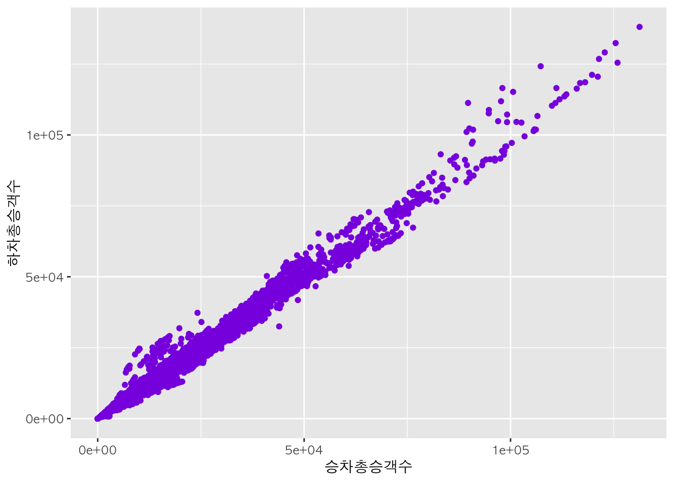
아래와 같이 노선 별로 점 색깔을 다르게 설정할 수도 있습니다.
sw %>%
  ggplot(aes(x = 승차총승객수, y = 하차총승객수)) +
  geom_point(aes(color = 노선명)) # 노선에 따라 점 색깔을 다르게 출력
원하는 색으로 구분 :
scale_color_manual
scale_color_manual() 함수를 이용하여 사용자가 원하는 색깔을 지정할 수 있습니다.
sw %>%
  ggplot(aes(x = 승차총승객수, y = 하차총승객수)) +
  geom_point(aes(color=노선명)) + # 노선명에 따라 점 색깔을 다르게 하여 산점도 출력
  scale_color_manual(values=c("blue", "DarkGreen", "orange", "skyblue", "purple","brown", "DarkOliveGreen","pink","gold")) # 노선명에 따라 다른 점 색깔을 사용자가 지정
color <- scale_color_manual(values=c("blue", "DarkGreen", "orange", "skyblue", "purple","brown", "DarkOliveGreen","pink","gold"))점 모양 :
shape
geom_point() 함수에 shape 인자를 추가하여 점의 모양을 선택할 수 있습니다. 인자 값으로 숫자를 할당할 경우 특정 모양으로 변경되고, 변수를 할당할 경우 변수의 범주 별로 점의 모양을 다르게 나타낼 수 있습니다.
sw %>%
  ggplot(aes(x = 승차총승객수, y = 하차총승객수)) +
  geom_point(aes(shape = 노선명)) # 노선에 따라 점 모양을 다르게 출력
## Warning: The shape palette can deal with a maximum of 6 discrete values because
## more than 6 becomes difficult to discriminate; you have 9. Consider
## specifying shapes manually if you must have them.
## Warning: Removed 2790 rows containing missing values (geom_point).
원하는 모양으로 구분 :
scale_shape_manual
scale_color_manual() 함수를 이용하여 사용자가 원하는 모양을 지정할 수 있습니다.
qplot(data  = sw,
      x     = 승차총승객수,
      y     = 하차총승객수,
      shape = 노선명) +                # 노선에 따라 점 모양을 다르게 출력
      scale_shape_manual(values = 1:9) # 노선에 따라 다른 점 모양을 사용자가 지정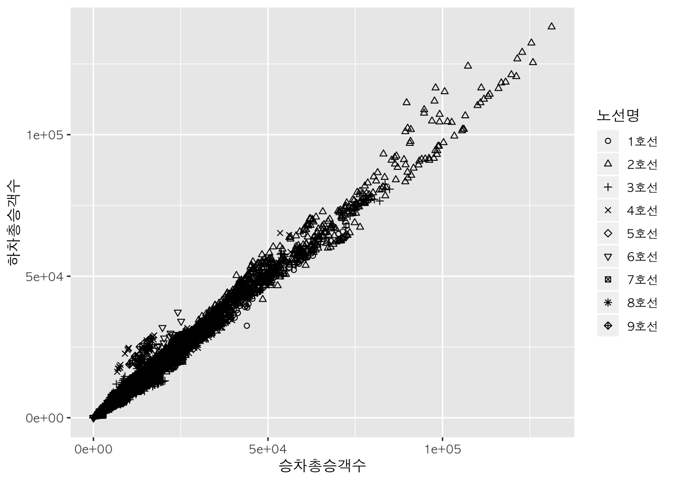
shape <- scale_shape_manual(values = 1:length(levels(sw$노선명)))

p + geom_point(aes(shape = 노선명)) +
  shape
범주 별 산점도 :
facet_wrap
다음과 같이 노선 별로 하나씩 각각의 산점도를 그릴 수도 있습니다.
sw %>%
  ggplot(aes(x = 승차총승객수, y = 하차총승객수)) +
  geom_point() +
  facet_wrap(~노선명) # 노선 별로 하나씩 각각의 산점도를 출력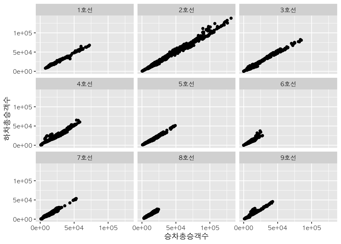
2. 막대그래프 (Bar Plot)
기본적으로 ggplot(data = 데이터명, aes(x=범주형데이터, weight=연속형데이터) + geom_bar()를 사용하여 막대그래프를 그릴 수 있습니다.
먼저 ggplot() 함수를 활용하여 x축과 y축을 생성한 후, geom_bar() 함수를 활용하여 막대그래프를 그립니다.
b <- ggplot(data=sw, aes(x = 노선명, weight = 승차총승객수))

sw %>%
  ggplot(aes(x = 노선명, weight = 승차총승객수)) + # x축에 노선명, y축에 승차총승객수를 할당하여 x축과 y축 생성
  geom_bar() # x축과 y축 생성 + 막대그래프 출력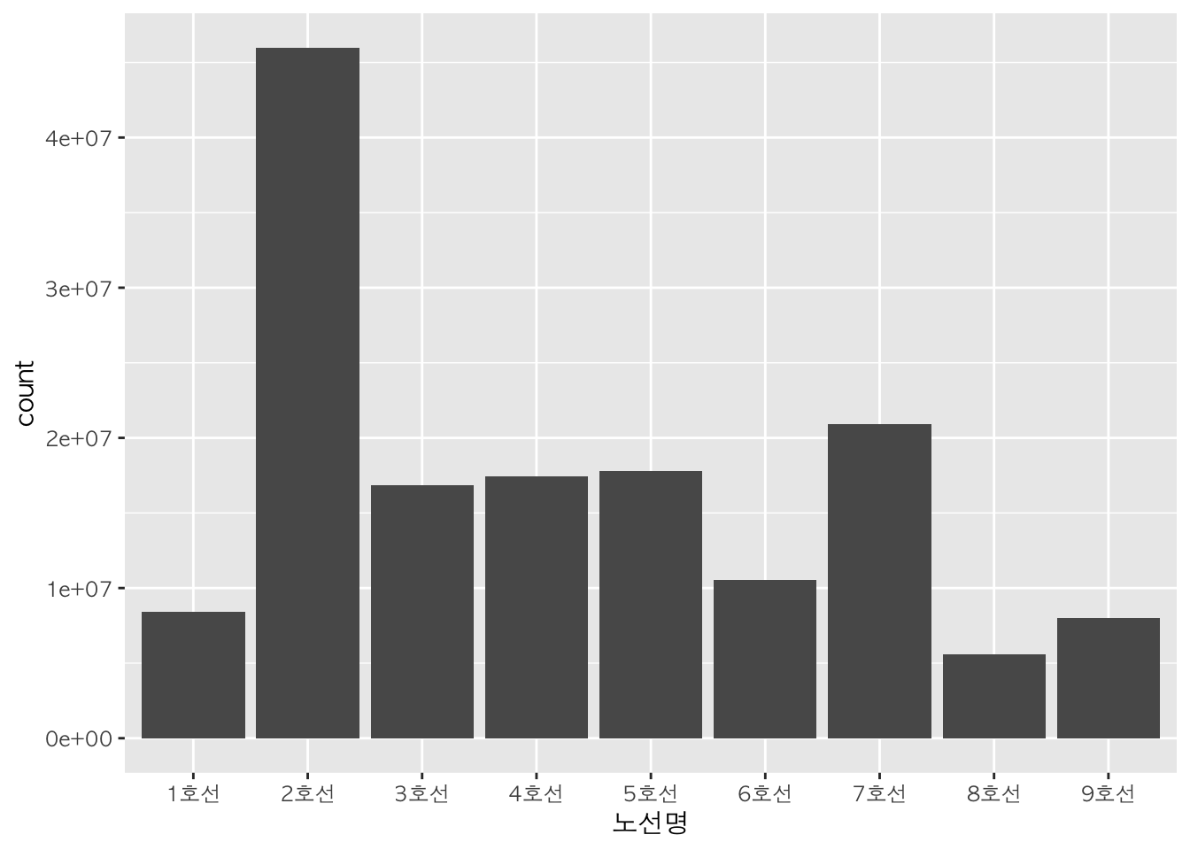
막대 색깔 :
fill
막대그래프의 막대의 색깔은 fill을 사용하여 지정할 수 있습니다.
qplot(data   = sw,
      x      = 노선명,
      weight = 승차총승객수,
      geom   = "bar",
      fill   = I("darkmagenta")) # 막대 색깔을 할당한 하나의 색깔로 출력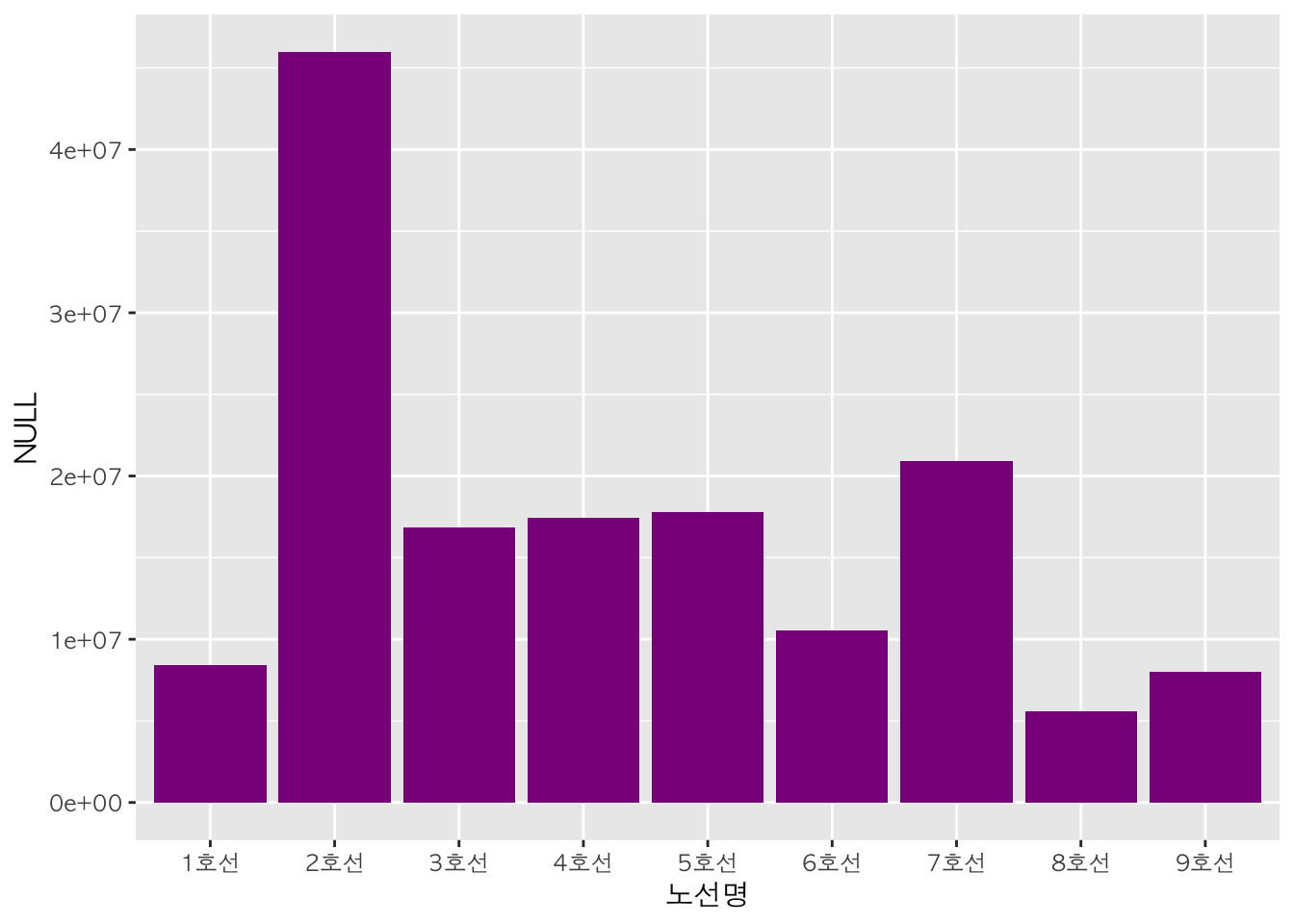
다음과 같이 변수의 범주에 따라 막대 색깔을 다르게 그래프를 나타낼 수도 있습니다.
qplot(data   = sw,
      x      = 노선명,
      weight = 승차총승객수,
      geom   = "bar",
      fill   = 노선명) # 노선 별로 막대 색깔을 다르게 출력
다음은 왼쪽부터 차례대로 막대 색깔을 하나의 색깔로 출력한 그래프, 변수의 범주 별로 막대 테두리 색깔을 다르게 출력한 그래프, 변수의 범주 별로 막대 색깔을 다르게 출력한 그래프입니다.
b + geom_bar(fill = "violetred4") -> b1 # 막대 색깔을 하나의 색깔로 출력

b + geom_bar(aes(color = 노선명)) -> b2 # 노선 별로 막대 테두리 색깔을 다르게 출력

b + geom_bar(aes(fill = 노선명)) -> b3 # 노선 별로 막대 색깔을 다르게 출력

gridExtra::grid.arrange(b1, b2, b3, nrow=1, ncol=3)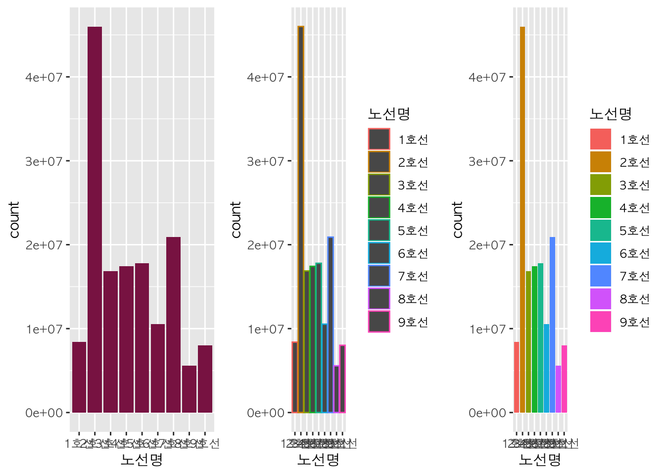
원하는 색으로 구분 :
scale_fill_manual
scale_fill_manual() 함수를 이용하여 사용자가 원하는 색깔을 지정할 수 있습니다.
b +
  geom_bar(aes(fill = 노선명)) +
  scale_fill_manual(values = c("blue", "darkgreen", "orange","skyblue", "purple", "brown", "darkolivegreen", "pink", "gold"))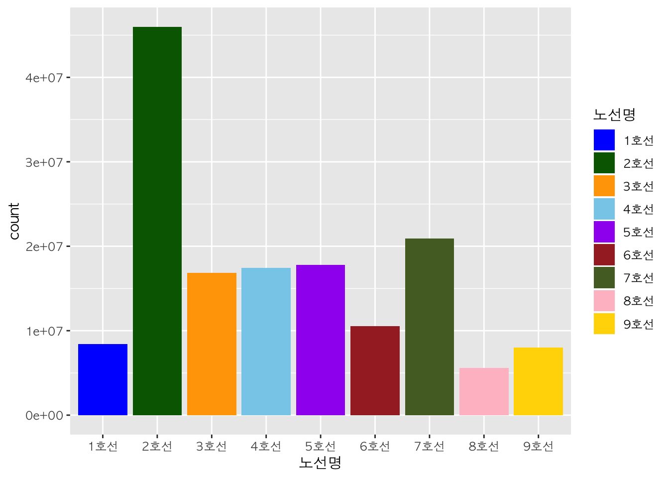
fill <- scale_fill_manual(values = c("blue", "darkgreen", "orange", "skyblue", "purple","brown", "darkolivegreen", "pink", "gold"))가로 막대그래프 :
coord_flip
coord_flip() 함수를 활용하여 막대그래프를 가로로 눕힌 방향으로 출력할 수도 있습니다.
b +
  geom_bar() +
  scale_fill_manual(values = c("blue", "darkgreen", "orange","skyblue", "purple", "brown", "darkolivegreen", "pink", "gold")) +
  coord_flip()
범례 위치 조정 :
legend.position
theme() 함수에 legend.position 인자를 추가하여 범례의 위치를 지정할 수 있습니다. 이때 인자 값은 ‘top’, ‘bottom’, ‘right’, ‘left’ 네가지 중 하나로 넣습니다.
b +
  geom_bar(aes(fill=노선명)) +
  scale_fill_manual(values = c("blue", "darkgreen", "orange","skyblue", "purple", "brown", "darkolivegreen", "pink", "gold")) +
  theme(legend.position="top") +
  ggtitle('범례 위치가 top일 때') -> b1

b +
  geom_bar(aes(fill=노선명)) +
  scale_fill_manual(values = c("blue", "darkgreen", "orange","skyblue", "purple", "brown", "darkolivegreen", "pink", "gold")) +
  theme(legend.position="bottom") +
  ggtitle('범례 위치가 bottom일 때') -> b2

b +
  geom_bar(aes(fill=노선명)) +
  scale_fill_manual(values = c("blue", "darkgreen", "orange","skyblue", "purple", "brown", "darkolivegreen", "pink", "gold")) +
  theme(legend.position="right") +
  ggtitle('범례 위치가 right일 때')-> b3

b +
  geom_bar(aes(fill=노선명)) +
  scale_fill_manual(values = c("blue", "darkgreen", "orange","skyblue", "purple", "brown", "darkolivegreen", "pink", "gold")) +
  theme(legend.position="left") +
  ggtitle('범례 위치가 left일 때') -> b4

gridExtra::grid.arrange(b1, b2, b3, b4, nrow = 2, ncol = 2)
막대 너비 조정 :
width
width 인자에 값을 지정하여 막대의 너비를 조정할 수 있습니다.
par(mfrow=c(1,3))
b + geom_bar(width=0.5) -> b1
b + geom_bar(width=0.2) -> b2
b + geom_bar(width=0.9) -> b3
gridExtra::grid.arrange(b1, b2, b3, nrow=1, ncol=3)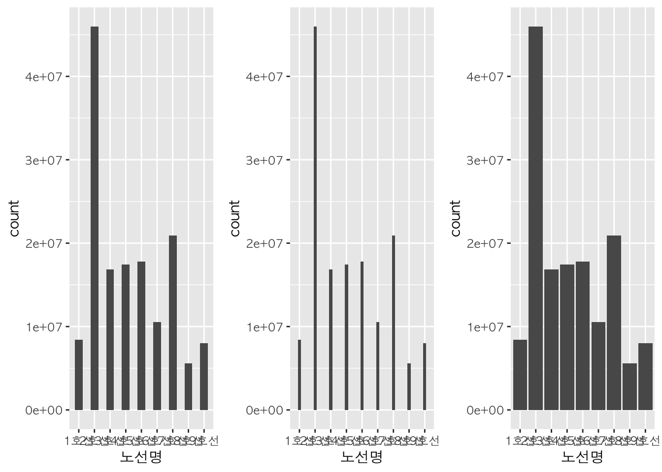
선택된 항목만 표시 :
scale_x_discrete
x축에서 특정 부분만 표시하고 싶을 때 scale_x_discrete() 함수를 사용하여 이를 지정해줄 수 있다.
b +
  geom_bar() +
  scale_x_discrete(limits=c("1호선", "2호선")) # 1호선과 2호선만 출력
## Warning: Removed 7240 rows containing non-finite values (stat_count).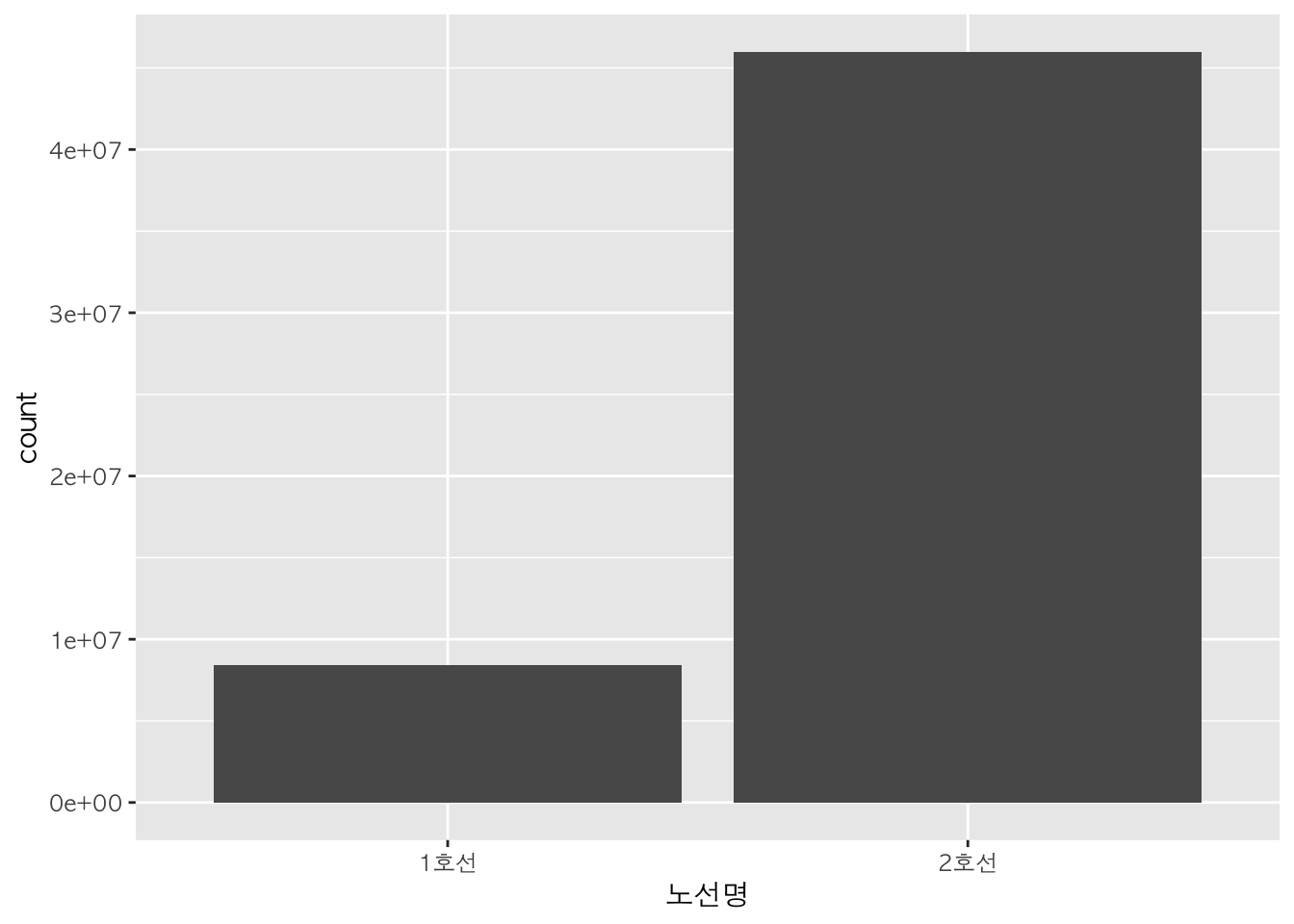
b +
  geom_bar(width=0.5) +
  scale_x_discrete(limits=c("1호선", "2호선"))
## Warning: Removed 7240 rows containing non-finite values (stat_count).
3. 상자그림 (Box Plot)
기본적으로 ggplot(data=데이터명, aes(x=범주형데이터, y=연속형데이터)) + geom_boxplot()를 사용하여 상자그림을 그릴 수 있습니다.
먼저 ggplot() 함수를 활용하여 x축과 y축을 생성한 후, geom_boxplot() 함수를 활용하여 상자그림을 그립니다.
box <- ggplot(data = sw, mapping = aes(x=노선명, y=승차총승객수))

sw %>%
  ggplot(mapping = aes(x=노선명, y=승차총승객수)) +
  geom_boxplot()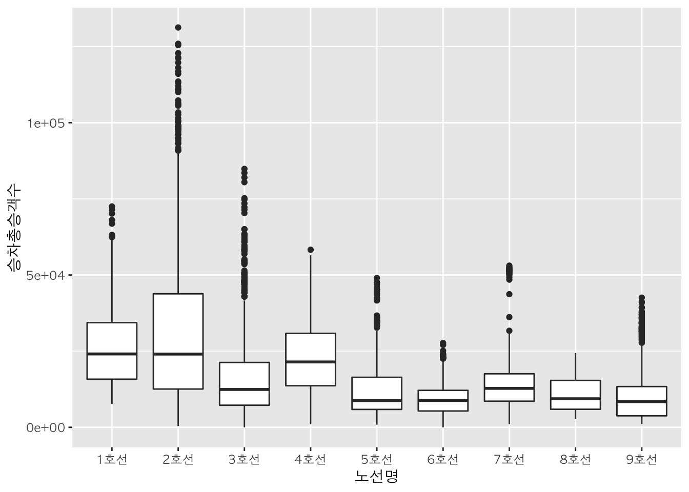
박스 색깔 지정 :
fill
상자의 색깔은 fill을 사용하여 지정할 수 있습니다.
상자 위 모든 점의 위치 표시 :
geom_jitter()
geom_jitter() 함수를 활용하여 상자그림에 산점도를 더하여 표현할 수 있습니다. 상자 위에 모든 점이 표시됩니다.
box + geom_boxplot() + geom_jitter() # 상자그림 위에 산점도 그림
box + geom_boxplot() + geom_jitter(width=0.1, mapping = aes(color=노선명))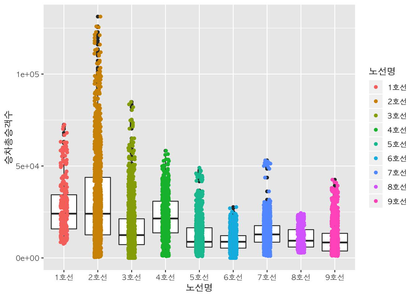
가로 상자그림 :
coord_flip()
coord_flip() 함수를 활용하여 상자그림을 가로로 눕힌 방향으로 출력할 수도 있습니다.
box + geom_boxplot() + coord_flip()
이상치(outlier) 강조 :
outlier.color,outlier.shape
geom_boxplot() 함수에 outlier.color 인자를 추가하여 이상치의 색깔을 지정할 수 있습니다. geom_boxplot() 함수에 outlier.shape를 추가하여 이상치의 모양을 지정할 수 있습니다.
box +
  geom_boxplot(outlier.color = "red", outlier.shape = 2) +
  color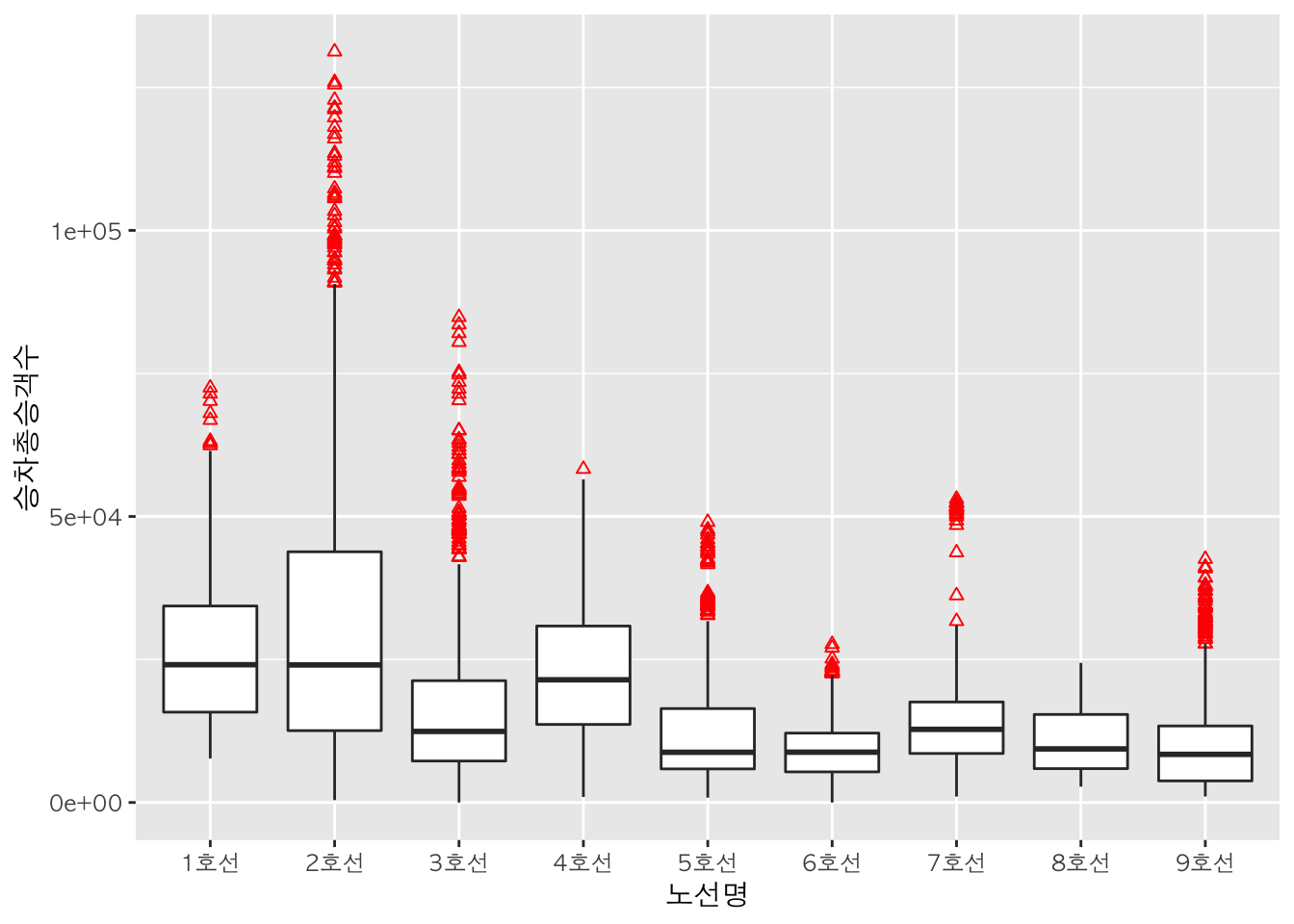
4. 히스토그램 (Histogram)
기본적으로 ggplot(data=데이터명, aes(x=연속형데이터)) + geom_histogram()를 사용하여 히스토그램을 그릴 수 있습니다.
먼저 ggplot() 함수를 활용하여 x축과 y축을 생성한 후, geom_histogram() 함수를 활용하여 히스토그램을 그립니다.
h <- ggplot(data    = sw,
            mapping = aes(x = 승차총승객수))
h + geom_histogram()
## `stat_bin()` using `bins = 30`. Pick better value with `binwidth`.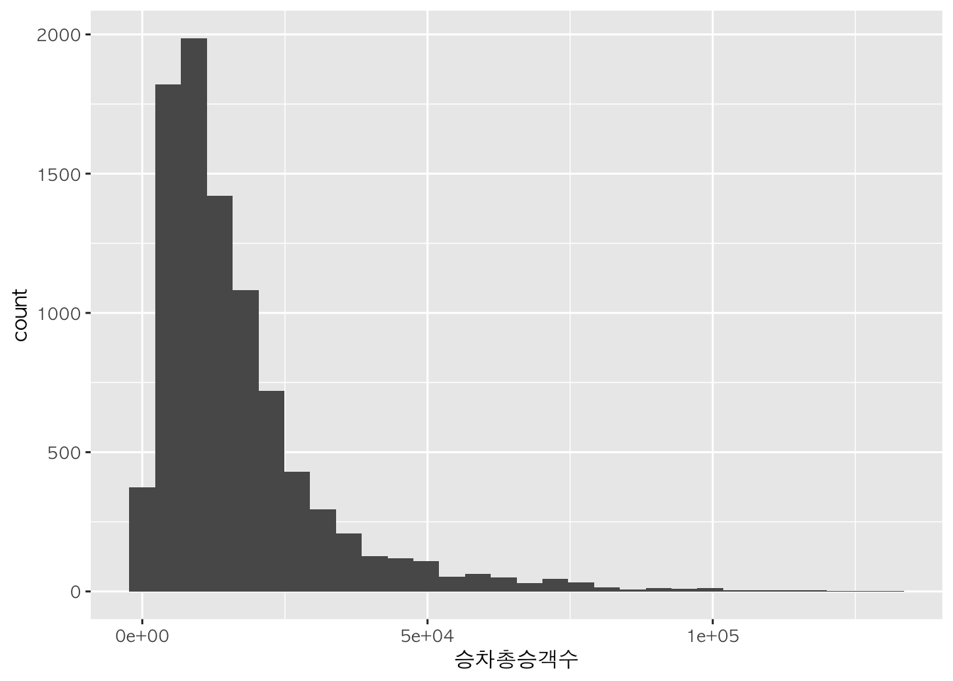
간격 :
bins,binwidth
h + geom_histogram(bins=10)
h + geom_histogram(bins=50)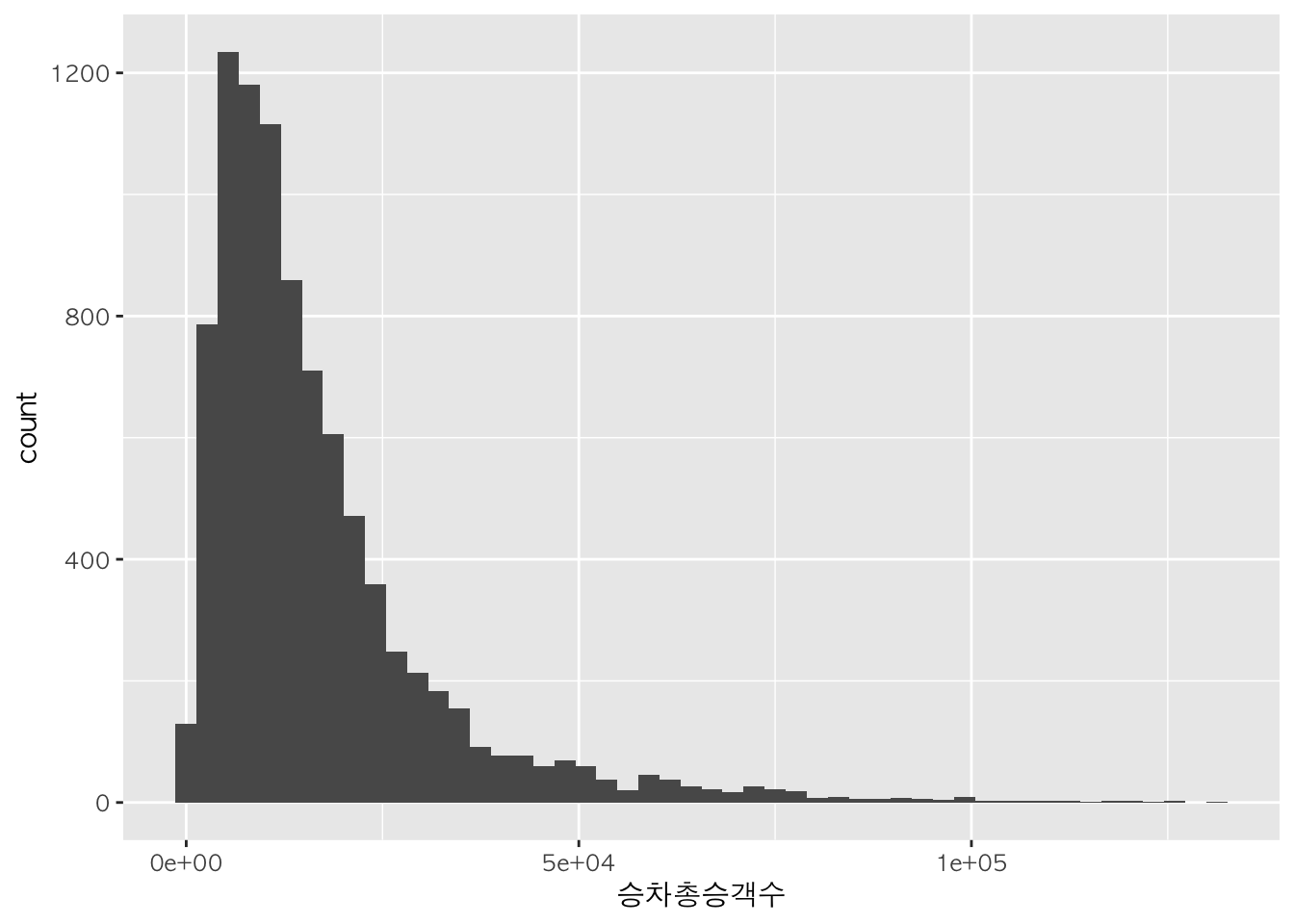
h + geom_histogram(binwidth=10000)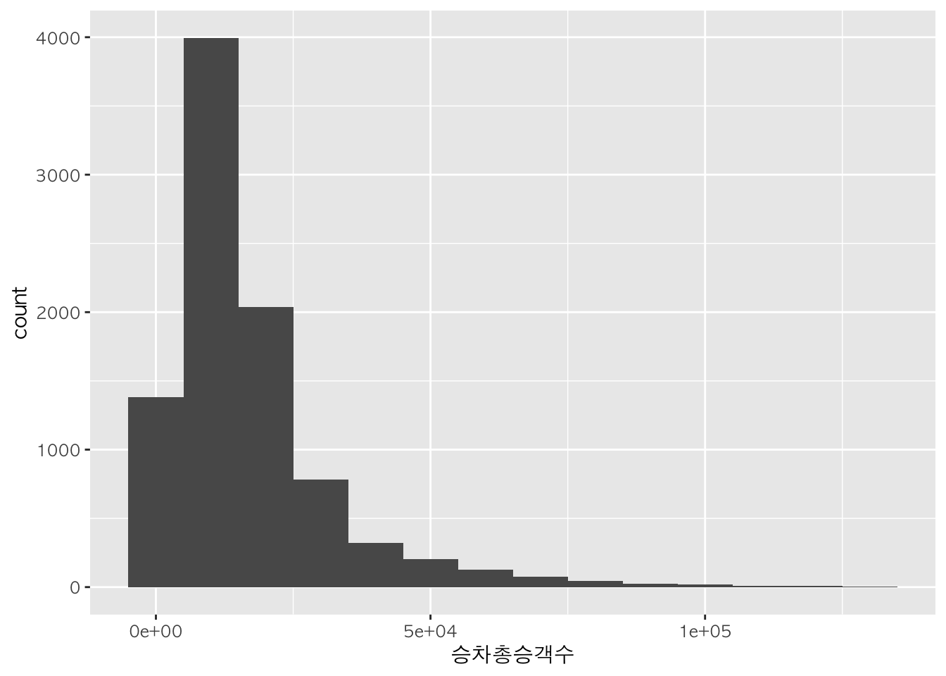
색깔 지정 :
color,fill
h + geom_histogram(color = "snow4")
## `stat_bin()` using `bins = 30`. Pick better value with `binwidth`.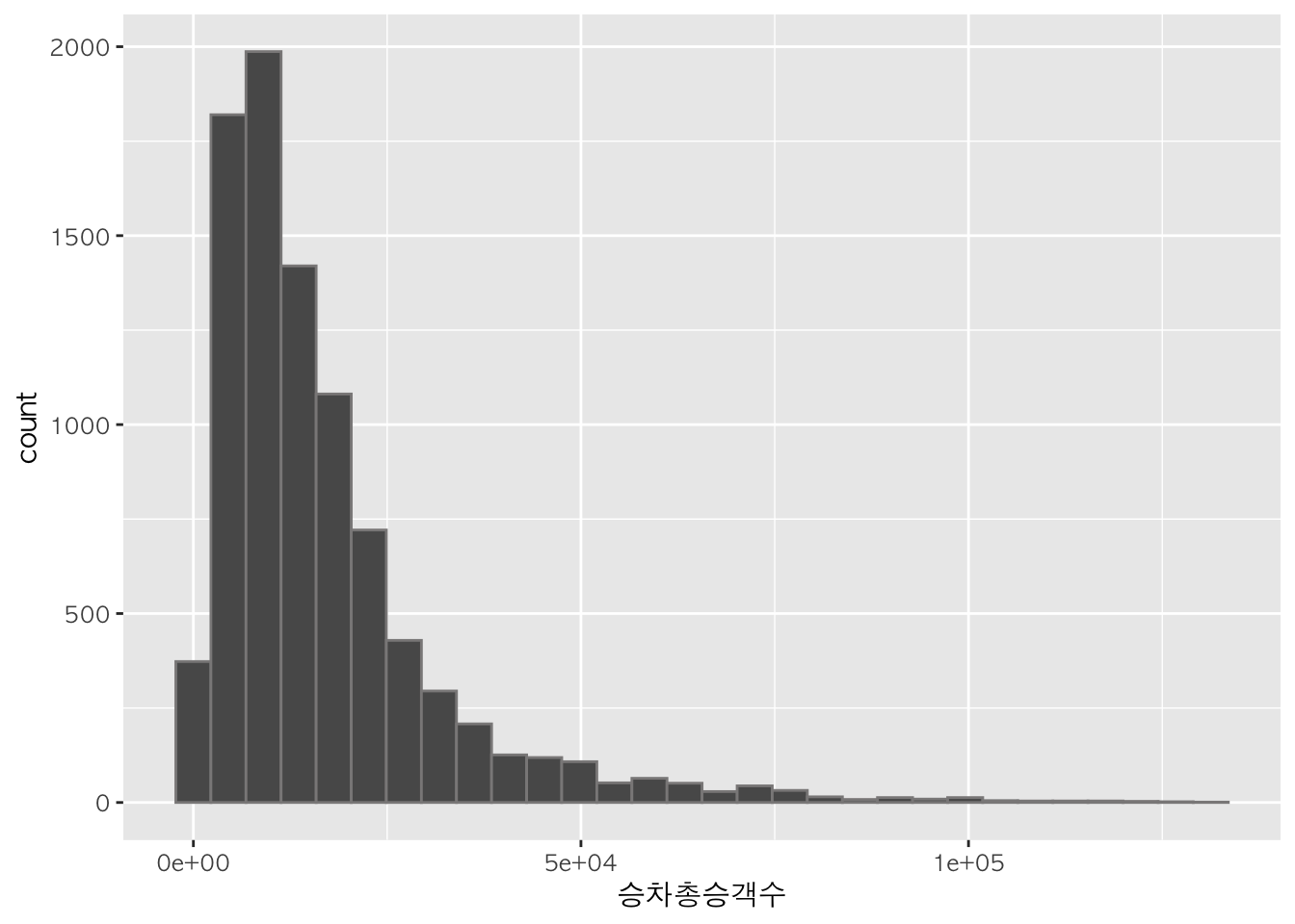
h + geom_histogram(fill="seagreen", color="white")
## `stat_bin()` using `bins = 30`. Pick better value with `binwidth`.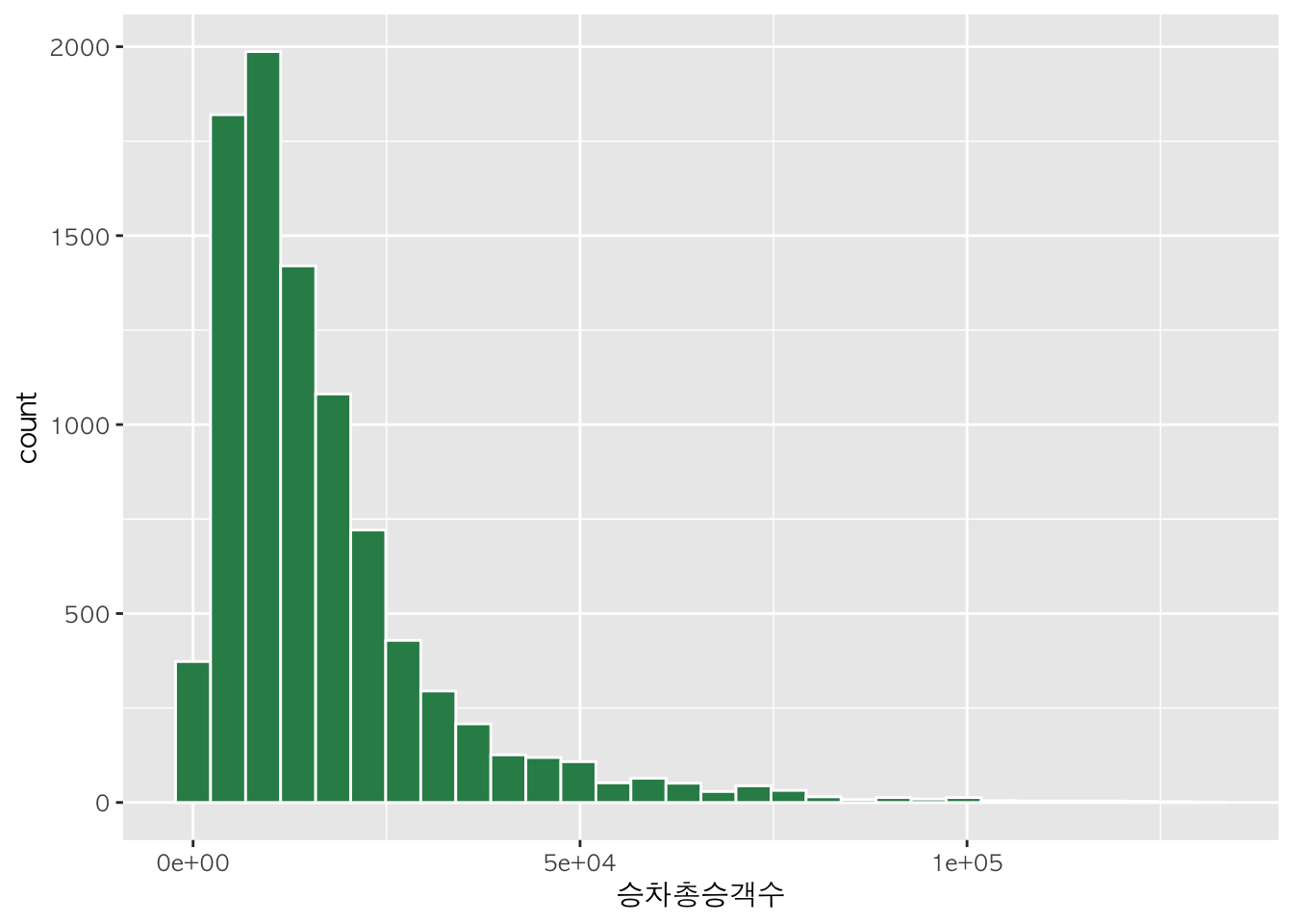
h + geom_histogram(bins=30, aes(fill=노선명)) + fill + facet_wrap(~노선명)
h + geom_histogram(bins=30, aes(fill=sw$노선명)) + fill
x축, y축 값 표시 :
scale_x_continuous,scale_y_continuous
axis.x <- scale_x_continuous(breaks = seq(0, max(sw$승차총승객수), 20000))
axis.y <- scale_y_continuous(breaks = seq(0, max(sw$승차총승객수), 100))

h + geom_histogram() + axis.x + axis.y
## `stat_bin()` using `bins = 30`. Pick better value with `binwidth`.
확률밀도 히스토그램
geom_histogram() 함수 대신 geom_density() 함수를 이용하면 윤곽선으로 표현된 확률밀도 히스토그램을 그릴 수 있다. geom_histogram() 함수에 stat = 'density'를 인자로 추가할 경우 면적으로 표현된 확률밀도 히스토그램을 그릴 수 있다.
h + geom_density() # 윤곽선으로 표현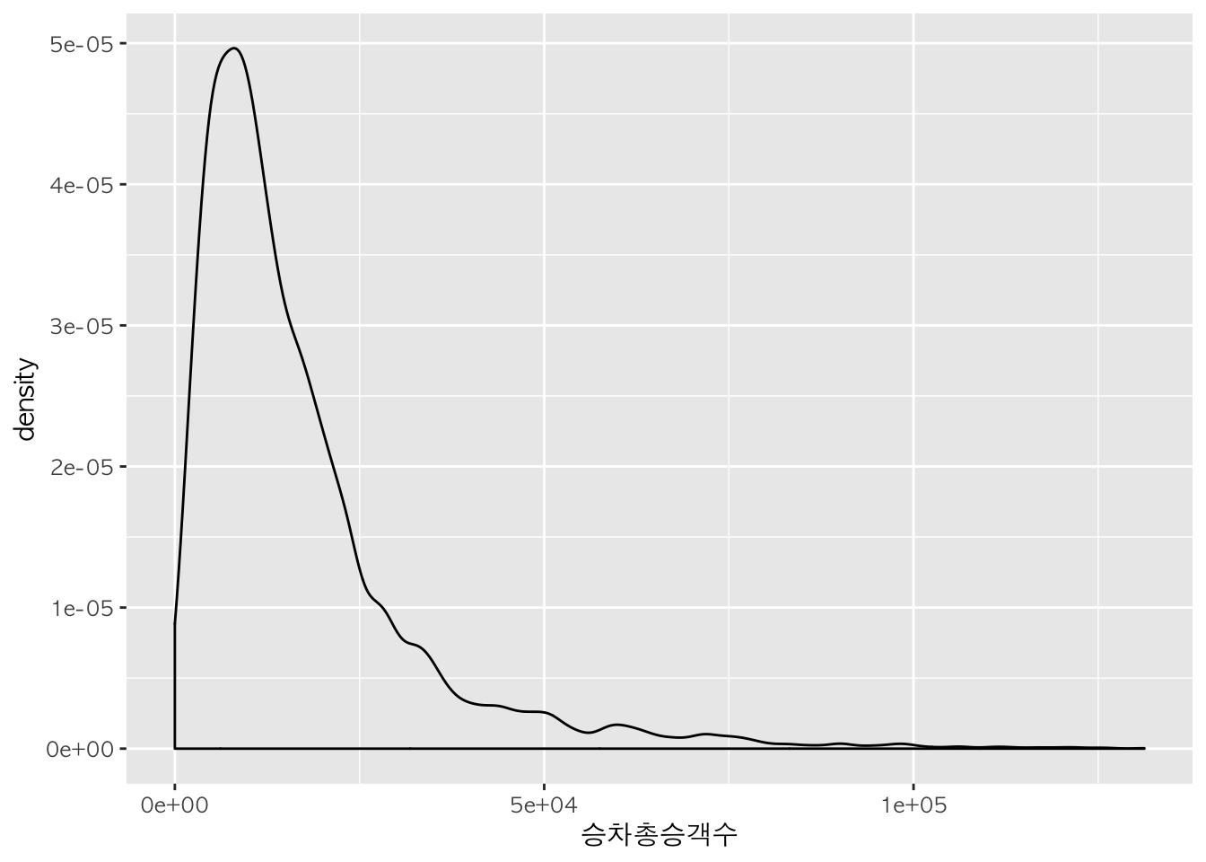
h + geom_histogram(stat="density") # 면적으로 표현 # y축을 density로 변경
## Warning: Ignoring unknown parameters: binwidth, bins, pad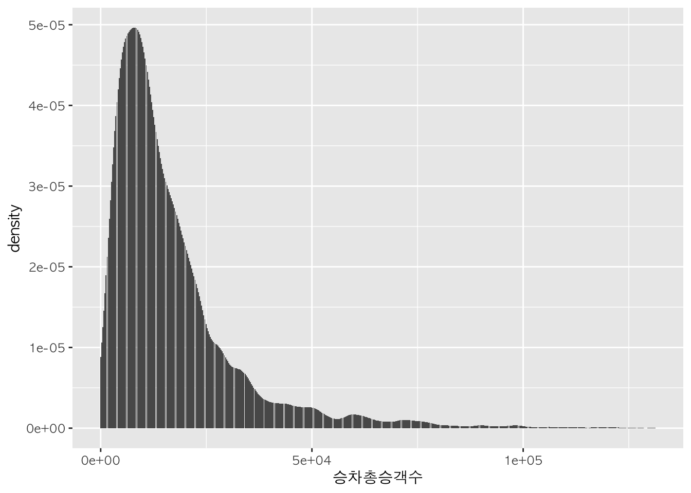
h + geom_histogram(stat="density") + geom_density() # 면적 + 윤곽선으로 표현
## Warning: Ignoring unknown parameters: binwidth, bins, pad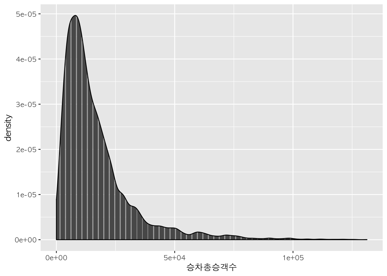
h + geom_density(aes(colour=노선명)) # 노선 별로 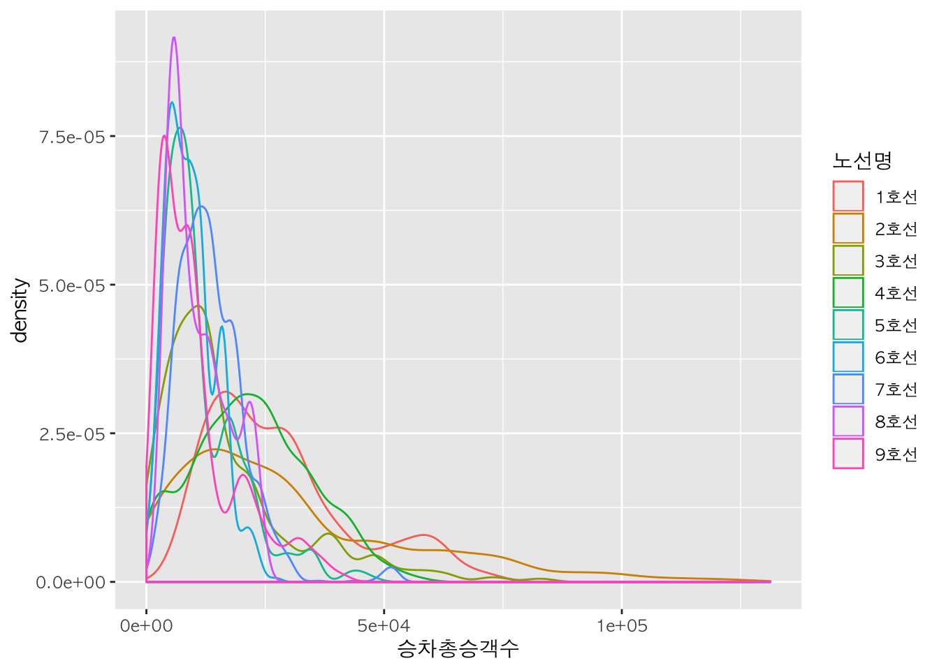
5. 선 그래프 (시계열 그래프)
기본적으로 ggplot(data=데이터명, aes(x=날짜데이터, y=연속형데이터)) + geom_line()를 사용하여 선 그래프를 그릴 수 있습니다.
먼저 ggplot() 함수를 활용하여 x축과 y축을 생성한 후, geom_line() 함수를 활용하여 선 그래프를 그립니다.
l <- ggplot(data = sw, aes(x = 사용일자, y = 승차총승객수))

sw %>%
  ggplot(aes(x = 사용일자, y = 승차총승객수)) +
  geom_line()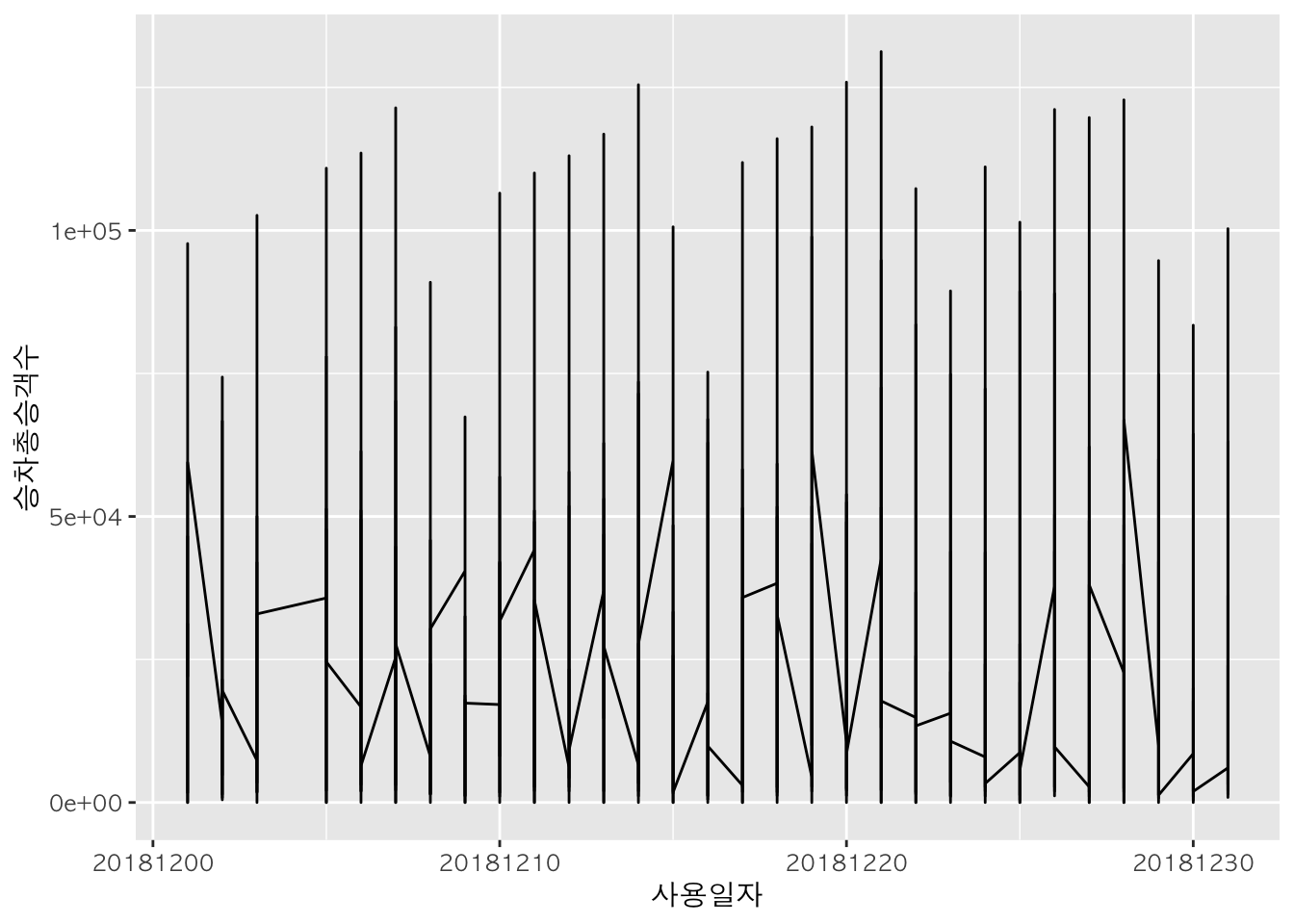
선 굵기 및 타입 설정 :
lwd,lty
station <- "강남"
st <- subset(subway, subset = subway$역명 == station)
l <- ggplot(data=st, aes(x=사용일자, y=승차총승객수))

l + geom_line(lwd=2) -> l1
l + geom_line(lty=2) -> l2
l + geom_line(lwd = 0.5, lty=4) -> l3
gridExtra::grid.arrange(l1, l2, l2, nrow=1, ncol=3)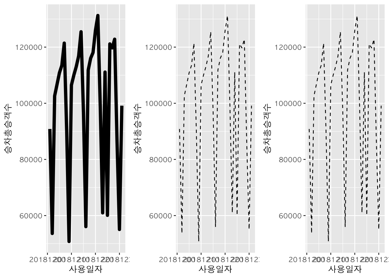
6. 기타
그래프 배경 테마
- theme_bw()
- theme_classic()
- theme_dark()
- theme_grey() : default
- theme_light()
- theme_linedraw()
그래프 제목 :
ggtitle
ggtitle() 함수를 이용하여 그래프 제목을 넣을 수 있다. 이때 subtitle 인자를 추가할 경우 부제목도 표현할 수 있다.
p + geom_point() + ggtitle("강남역 일별 승차총승객수 현황",
                       subtitle="2018 1월")
축 제목 :
xlab,ylab
p +
  geom_point() +
  ggtitle("강남역 일별 승차총승객수 현황", subtitle="2018 1월") +
  xlab("일자") +
  ylab("승차인원수")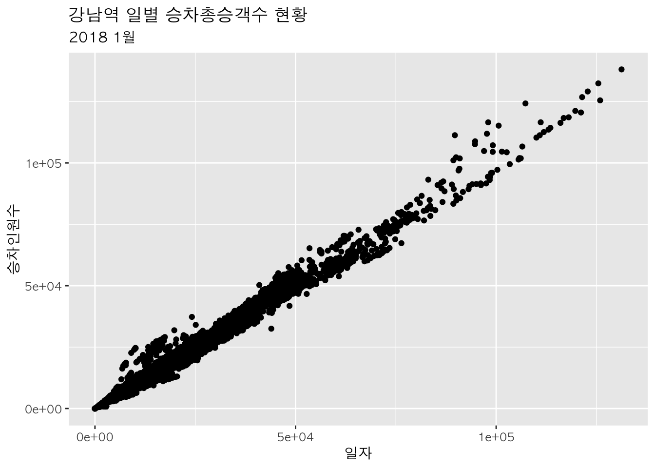
참조선 그리기 :
geom_vline,geom_hline
geom_vline() 함수는 세로선을, geom_hline() 함수는 가로선을 추가하는 데에 사용된다.
p + geom_point() + geom_vline(xintercept = 60000, lty = 2)
p + geom_point() + geom_hline(yintercept = 70000, lty = 2)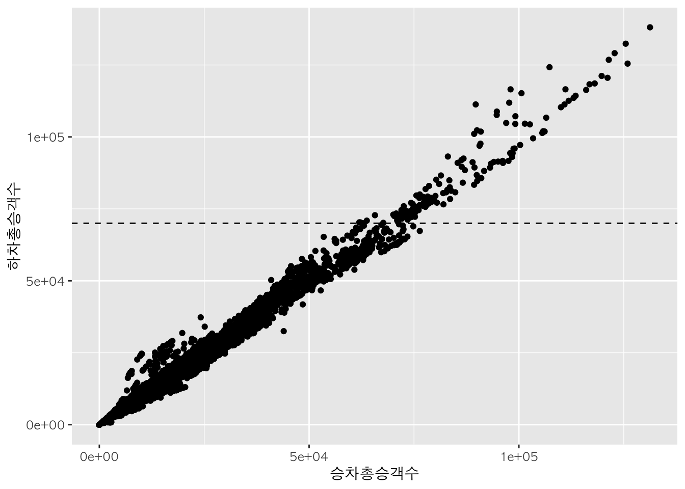
p + geom_point() +
  geom_vline(xintercept = 10000, lty=2) +
  geom_hline(yintercept = 10000, lty=2)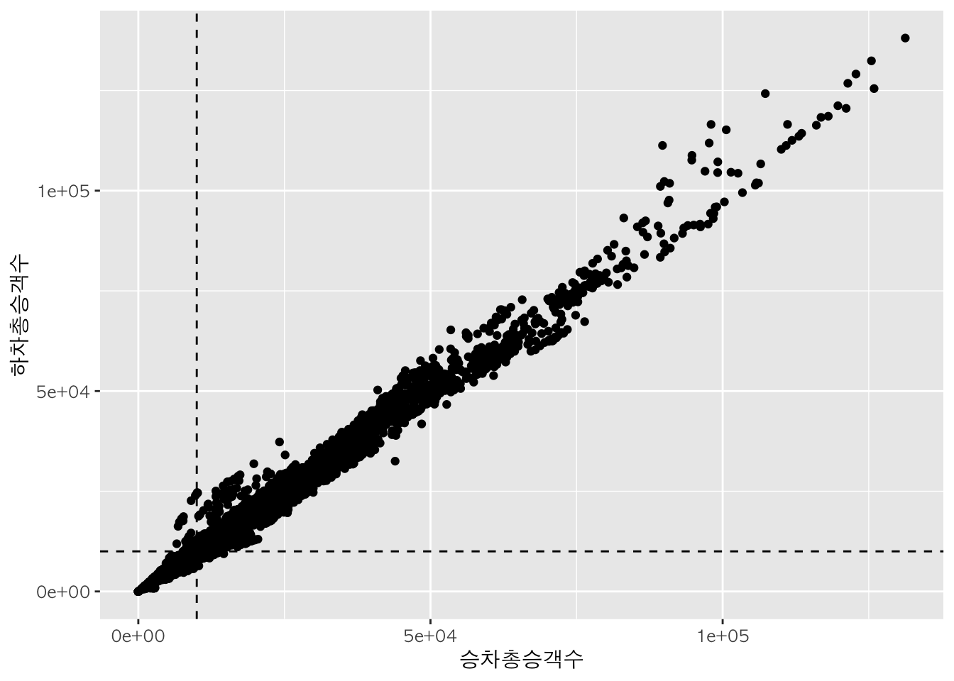
색 그라데이션 주기 :
scale_colour_gradient
scale_colour_gradient() 함수를 활용하여 색의 그라데이션을 표현할 수 있다. 이때 디폴트값은 blue이다.
p + geom_point(aes(color = 승차총승객수))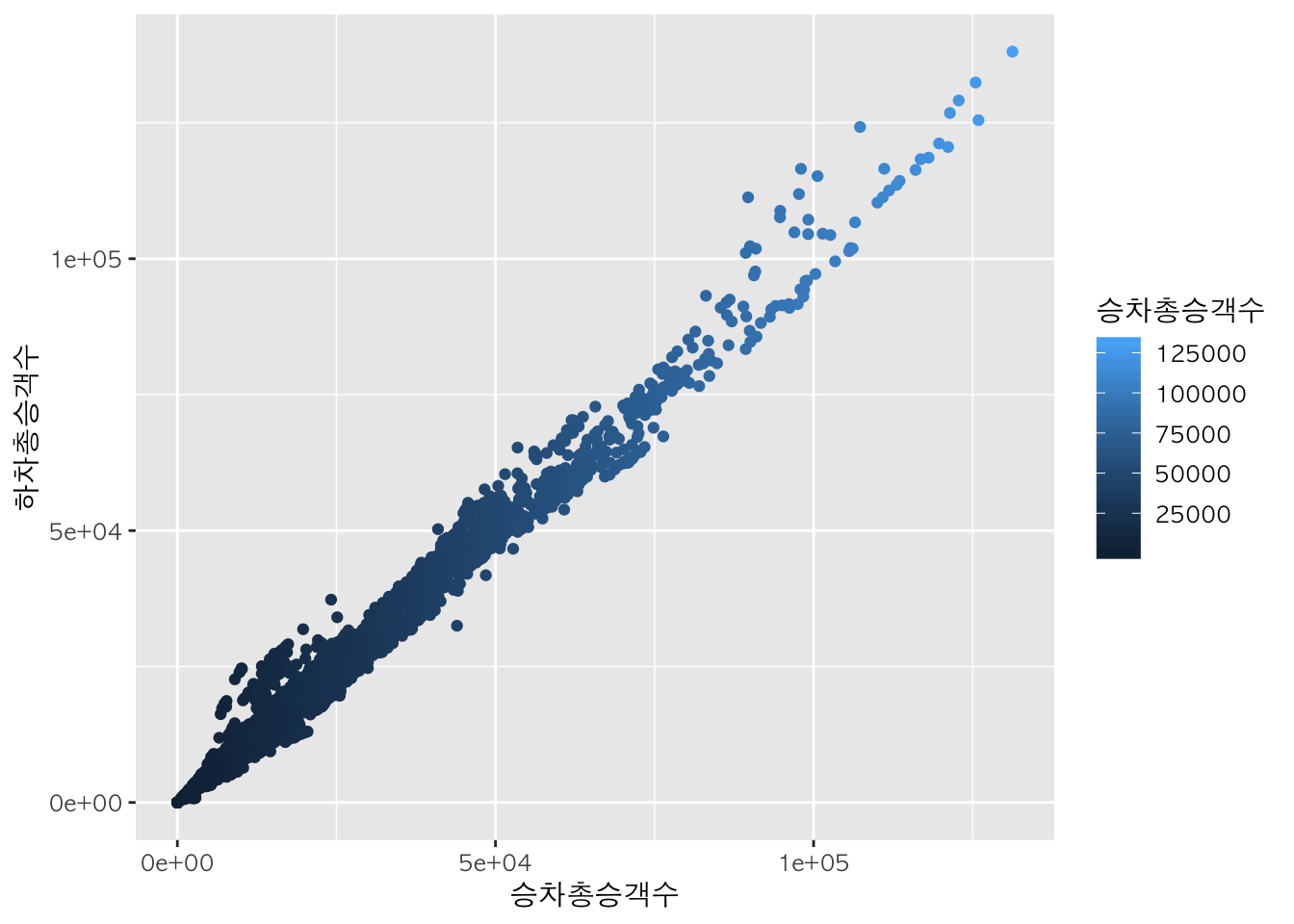
p + geom_point(aes(color = 승차총승객수)) + scale_color_gradient(low = "pink", high = "purple")
p + geom_point(aes(colour=sw$승차총승객수)) +
scale_colour_gradient(low="gray", high="black") 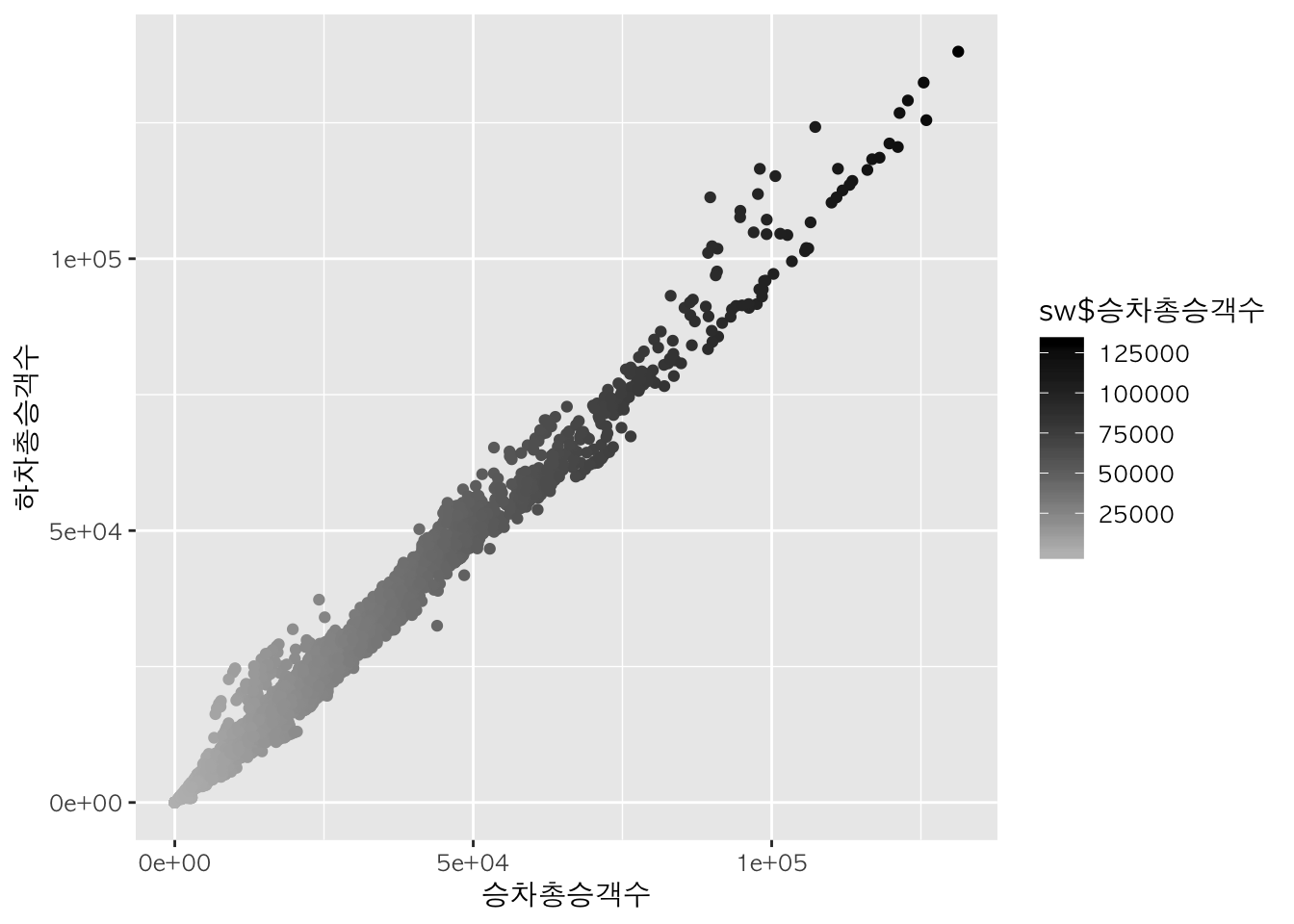
그래프 화면 분할 :
grid.arrange
gridExtra 패키지의 grid.arrange() 함수를 이용하여 한 화면에 여러개의 그래프를 나타낼 수 있습니다.
b +
  geom_bar(aes(fill=노선명)) +
  scale_fill_manual(values = c("blue", "darkgreen", "orange","skyblue", "purple", "brown", "darkolivegreen", "pink", "gold")) +
  theme(legend.position="top") -> b1

b +
  geom_bar(aes(fill=노선명)) +
  scale_fill_manual(values = c("blue", "darkgreen", "orange","skyblue", "purple", "brown", "darkolivegreen", "pink", "gold")) +
  theme(legend.position="bottom") ->b2

b +
  geom_bar(aes(fill=노선명)) +
  scale_fill_manual(values = c("blue", "darkgreen", "orange","skyblue", "purple", "brown", "darkolivegreen", "pink", "gold")) +
  theme(legend.position="right") ->b3

b +
  geom_bar(aes(fill=노선명)) +
  scale_fill_manual(values = c("blue", "darkgreen", "orange","skyblue", "purple", "brown", "darkolivegreen", "pink", "gold")) +
  theme(legend.position="left") ->b4

gridExtra::grid.arrange(b1, b2, b3, b4, nrow = 2, ncol = 2)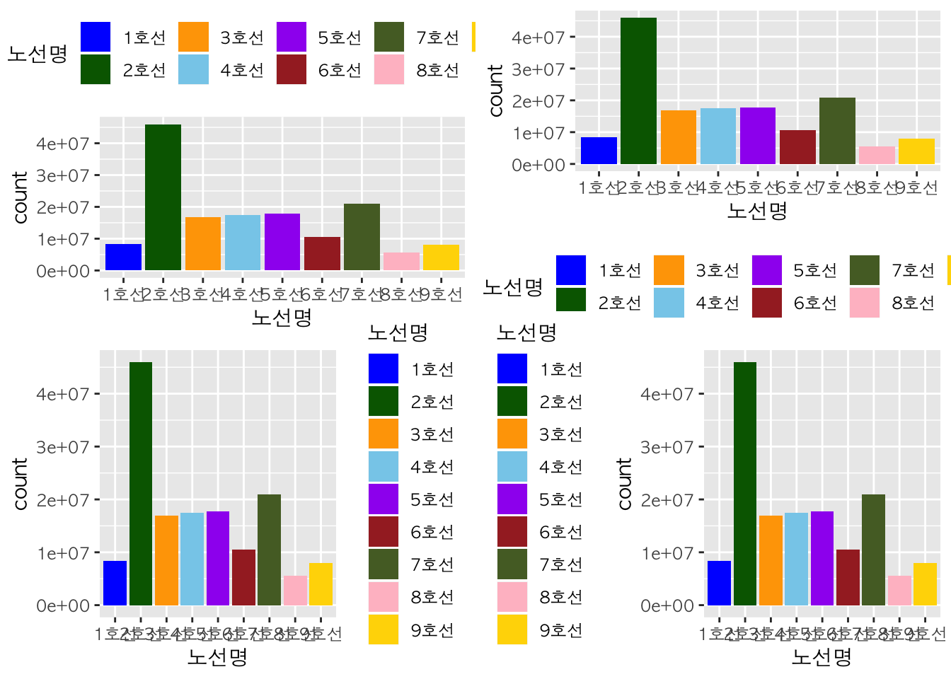
그래프 저장 :
ggsave
ggsave() 함수에 경로를 할당하여 그래프를 저장할 수 있습니다. 이때 파일 형태는 png, jpg, pdf가 가능합니다.